Case Study - What Drives the Price of Food? Oil, Fertiliser, El Nino and the 2026/27 Squeeze
An interactive analytical study over decades of public data: how oil, fertiliser and El Nino move South African food prices, what Washington does and does not explain, and a dated forecast for 2026/27.
- Client
- Independent study
- Year
- Service
- Data Analysis, Interactive Visualisation, Data Pipelines
- Data points, one pipeline
- 8,849
- Public sources unified
- 10
- Fertiliser-to-food best-fit lag
- 10 months
- Interactive charts
- 7
Why this study exists
Client reporting has a frustrating property: the better the work, the less of it anyone outside the engagement ever sees. So this study is independent and self-initiated, runs entirely on public data, and applies the discipline I bring to client pipelines, in the open. Every series is fetched by code, validated against a schema and committed to the repository. Anyone can rerun it and get the same charts.
The question is one every South African business feels in its cost base. Food inflation printed at 1.94% in May 2026, down from 5.66% in July 2025 and its lowest in years. Brent crude, meanwhile, has jumped by roughly half since February 2026. Those two facts are in tension, and the lags measured below say roughly when that tension should resolve. This study measures the drivers one at a time, discards the ones that fail, and ends with a dated, falsifiable forecast for 2026/27.
Driver one: oil
The intuition is straightforward. South Africa moves food by road, diesel is priced off crude, so when oil jumps, food should follow quickly. The data disagrees about the speed. Against SA food inflation, Brent year-on-year correlates at -0.16 in the same month, and the relationship only turns meaningfully positive a full year out, reaching a modest 0.26 at a 12-month lag (n = 209 months).
The world food index behaves the opposite way: it tracks oil at 0.48 in the same month and the link fades with every month of lag. US food sits between the two, starting weak at 0.09 and strengthening steadily to 0.42 a year out. Three different shapes from one driver. My reading is that world commodity prices reprice with oil almost immediately, but by the time that signal has travelled through the rand, the farm gate and the retail shelf, South African dynamics have mostly drowned it out. Oil matters here, but slowly, and mostly through the channels the next two sections measure.
Driver two: fertiliser, the early warning
Drag the slider below and watch the correlation move. At zero lag, fertiliser costs and SA food inflation are slightly negatively correlated, at -0.16. Slide the lead time forward and the relationship climbs month after month to a peak of r = 0.52 at 10 months, then decays gently out to 18. That smooth, single-peaked curve is the signature of a genuine cost pass-through rather than noise: fertiliser bought today is priced into planting decisions, harvests and shelf prices roughly ten months later.
The basket here is urea, DAP and potash, equal-weighted and indexed to 2015 = 100, and its history shows what this channel can do. Between January 2021 and April 2022 it more than tripled, from 94.3 to 322.6. An r of 0.52 over 209 months makes this the strongest single relationship in the whole dataset, and it is still only a moderate one. Fertiliser is a useful ten-month warning light for SA food prices, never a guarantee.
Driver three: the weather
ENSO, the Pacific cycle behind El Nino and La Nina, is the driver with the most folklore attached, so this section keeps separate two claims that usually get blended.
The first claim is that ENSO episodes move world maize prices. They do: months inside an episode average 6.72% year-on-year world maize inflation (n = 390) against 3.34% outside (n = 396), a gap of 3.38 points. But split the episodes by kind and the aggregate turns out to be hiding the story. La Nina months average +16.36% (n = 195); El Nino months average -2.92% (n = 195). It is La Nina, stressing crops in the US Midwest and Argentina, that moves world maize, while El Nino months are on average mildly deflationary for it.
The second claim is that El Nino is the South African drought story, and that one is also true, through a different mechanism. The 2015/16 El Nino, at a peak Oceanic Nino Index of 2.75 the strongest in this episode record, brought the drought South African farmers still measure others against; the 2023/24 event (peak 2.06) is the most recent. When a strong El Nino arrives, the SA story is domestic drought and SA food inflation, whatever world maize happens to be doing. Conflating the two claims produces bad forecasts in both directions.
Both matter now for the same reason. The ONI has climbed from -0.55 in late 2025 to 0.98 by the April-June 2026 reading, two consecutive readings past the +0.5 El Nino threshold. My episode detector requires five consecutive months before it calls an event, so nothing is confirmed yet. On the raw numbers, an El Nino looks to be forming.
The Washington factors
The hypothesis, stated fairly: American military spending drives commodity cycles, and one party’s administrations are worse for food prices than the other’s. Plenty of people believe some version of this, and it deserves a test rather than a sneer.
The test has a hard constraint. Annual US defence spending aligned to food inflation and presidential terms gives 38 observations, 1989 through 2026. Within that constraint, defence-spending growth correlates with same-year US food inflation at 0.16, and with the following year’s at 0.12. Mean food inflation runs at 3.00% under Republican administrations (n = 18 years) and 2.84% under Democratic ones (n = 20). A gap of 0.16 points between samples that small is well within what chance alone produces, and each window contains one major external food shock (2008 under a Republican, 2022 under a Democrat) that dwarfs any plausible party effect.
So this is a null result, and I am reporting it as one. Thirty-eight annual points are enough to say the relationship is weak in both directions, with r under 0.2 at both lags. They are not enough to distinguish “no effect” from “an effect too small for 38 points to see”, and I am not claiming the former. What would change this verdict: a mechanism visible at monthly rather than annual resolution, or a party gap that keeps widening as new years accumulate. I ran the shock-year check. Dropping 2008 and 2022 moves the means to 2.86% under Republican administrations (n = 17 years) and 2.46% under Democratic ones (n = 19), which widens the gap to 0.39 points. A gap smaller than its own sampling error is still noise, so the null stands.
The London question
This section started life as “the London anomaly”. The hypothesis: oil wealth parks itself in London property, so when oil booms, London prices should co-move with crude in a way New York, Japan, France and Germany do not. I indexed all five markets to 2015 = 100 and correlated each against Brent year-on-year at every lag from zero to eight quarters (n = 131 to 134 quarters per market).
London comes out at r = 0.20, and lagging it does not help; its best fit is at zero lag. That is mid-pack. New York sits higher at 0.30, Germany lower at 0.11, Japan at effectively zero. The market that genuinely co-moves with oil is France, at 0.49, well over double London’s figure.
So the hypothesis failed, and the failure is the finding. If petro-money distorts London property, it does not show up as co-movement with the oil price at any lag this study measured. France as the standout is something I did not expect and will not guess at here; it would be its own study. The section keeps its title as a question because a question is what the data handed back.
2026/27, on the record
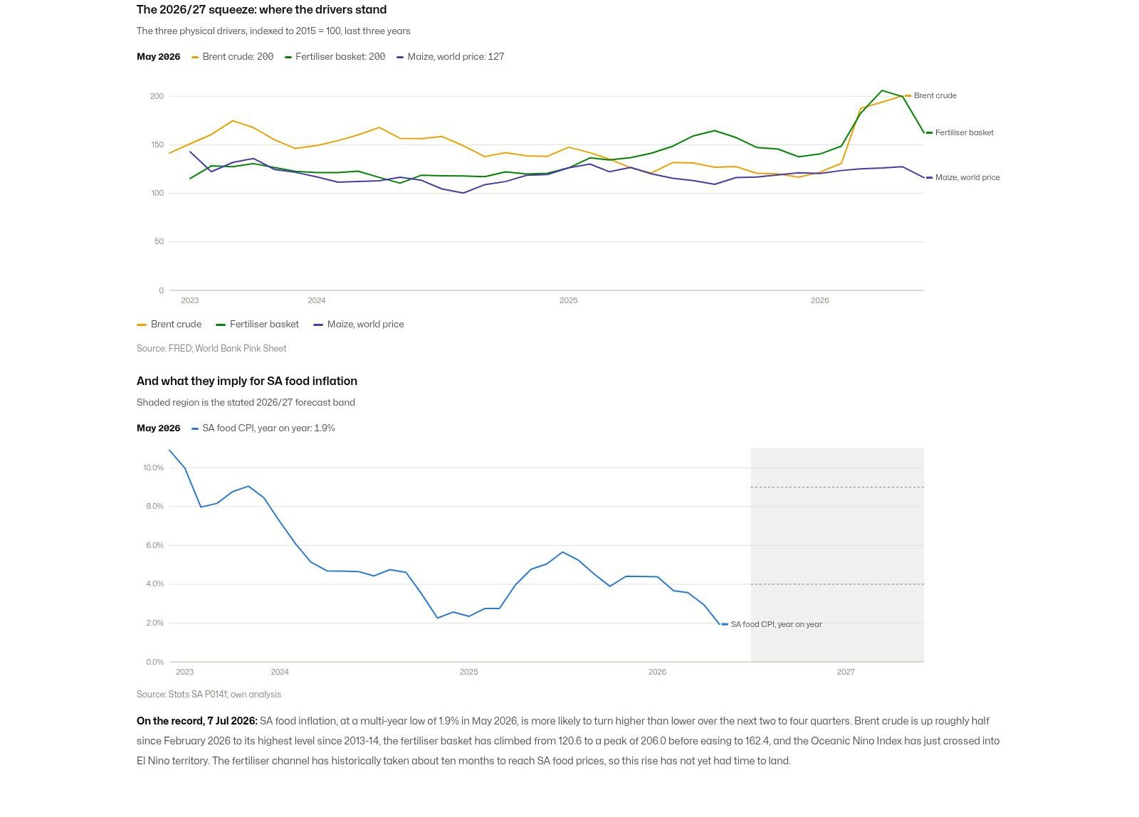
Every driver that survived the sections above is now pointing the same way. Brent is up roughly half since February 2026, to its highest level since 2013-14. The fertiliser basket climbed from 120.6 in December 2024 to a peak of 206.0 in April 2026, easing to 162.4 by June: a real cost echo of the oil spike, already two months past its top. The ONI has crossed into El Nino territory, though not yet a confirmed episode. And SA food inflation sits at a multi-year low, which is exactly where the ten-month fertiliser lag says it should still be, because the cost pressure of early 2026 has not had time to land.
So, stated on 7 July 2026: SA food inflation is more likely to turn higher than lower over the next two to four quarters, and I expect it to run between 4% and 9% over the twelve months from July 2026 to June 2027. That band is drawn into the chart below, so nobody has to take my word for what was predicted or when.
Two caveats, because this should not be oversold. The strongest relationship in the dataset tops out at r = 0.52; the historical transmission is real but partial, and this is a direction-and-band call rather than a point forecast. And the developing El Nino has not yet met my own pipeline’s five-month rule; if the ONI drops back below 0.5, the weather leg of the argument falls away. If SA food inflation is still below 4% by mid-2027, this forecast was wrong, and this page will say so.
On the record, 7 Jul 2026: SA food inflation, at a multi-year low of 1.9% in May 2026, is more likely to turn higher than lower over the next two to four quarters. Brent crude is up roughly half since February 2026 to its highest level since 2013-14, the fertiliser basket has climbed from 120.6 to a peak of 206.0 before easing to 162.4, and the Oceanic Nino Index has just crossed into El Nino territory. The fertiliser channel has historically taken about ten months to reach SA food prices, so this rise has not yet had time to land.
How this was built
The pipeline is a TypeScript script run with Bun: fetch each source, cache the raw response in the repository, parse, validate, write eight JSON payloads, and commit them next to this page. Every payload passes a zod schema at write time, so a malformed rebuild fails loudly instead of publishing quietly wrong charts. Each parser has tests pinned to real fixtures, and those tests earned their keep on day one: the live World Bank workbook, Stats SA’s zipped spreadsheet and FRED’s pre-1989 history each broke first contact in ways the fixtures then locked down.
The charts are thin D3-in-React islands, rendered to SVG on the server by Astro and hydrated only where interaction earns its place: the fertiliser lag slider, hover detail on every series, the shaded episode and forecast bands. That approach follows my own comparison of charting libraries, written up in choosing a charting library: D3 costs more per chart and repays it with exact control over annotation and layout, which an analytical essay depends on.
- TypeScript
- Bun
- Astro
- React
- D3
- Zod
- FRED, World Bank, NOAA, Stats SA, Land Registry
Data and provenance
Every series is public, and the longest stretch back to the late 1940s. The pipeline unified 8,849 rows across 10 sources; all of it was retrieved 2026-07-07, and refreshing the whole study is one command.
| Source | Points | Licence |
|---|---|---|
| FRED: Brent crude (IMF) | 413 | public |
| FRED: US food CPI | 952 | public |
| FRED: US national defence expenditures | 317 | public |
| FRED: Case-Shiller New York | 472 | public |
| FRED/BIS: residential property Japan, France, Germany | 733 | BIS terms |
| World Bank Pink Sheet: urea, DAP, potash, maize, food index | 3,906 | CC BY 4.0 |
| NOAA CPC: Oceanic Nino Index | 917 | public |
| Stats SA P0141: CPI food and non-alcoholic beverages; bread and cereals | 442 | public |
| HM Land Registry UK HPI: London average price | 697 | OGL v3 |
| US presidential terms (hand-entered) | 7 | n/a |